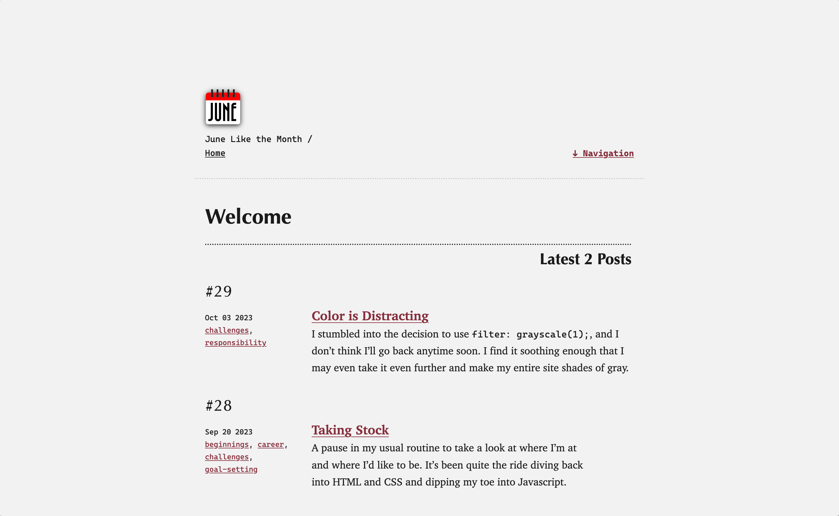
This site is built using Eleventy. I used the Eleventy Base Blog v8 as a starting point, but my hope is that it diverges enough to be considered my own.
My design sensibility is somewhere between brutalism and minimalism—I’ve decided the closest descriptor is probably “essentialism.” I touch just enough to hint at an identity, but generally, my designs look like they belong to the client, not to me. (Except this site, where I am both client and designer… and like most designers know, that gets complicated quickly!)
This site implements Modern Font Stacks for the site for speed and accessibility.
- the Classical Humanist stack for headings
- the Transitional stack for paragraphs
- the Geometric Humanist stack for buttons and labels
- the Monospace stack for metadata and code
Colors 🔗
Default Display 🔗
HSL
0, 0%, 95%
HSL
0, 0%, 10%
HSL
350, 50%, 35%
HSL
350, 90%, 60%
Dark Mode 🔗
HSL
210, 15%, 10%
HSL
0, 0%, 85%
HSL
210, 100%, 85%
HSL
210, 75%, 50%
Website Changelog 🔗
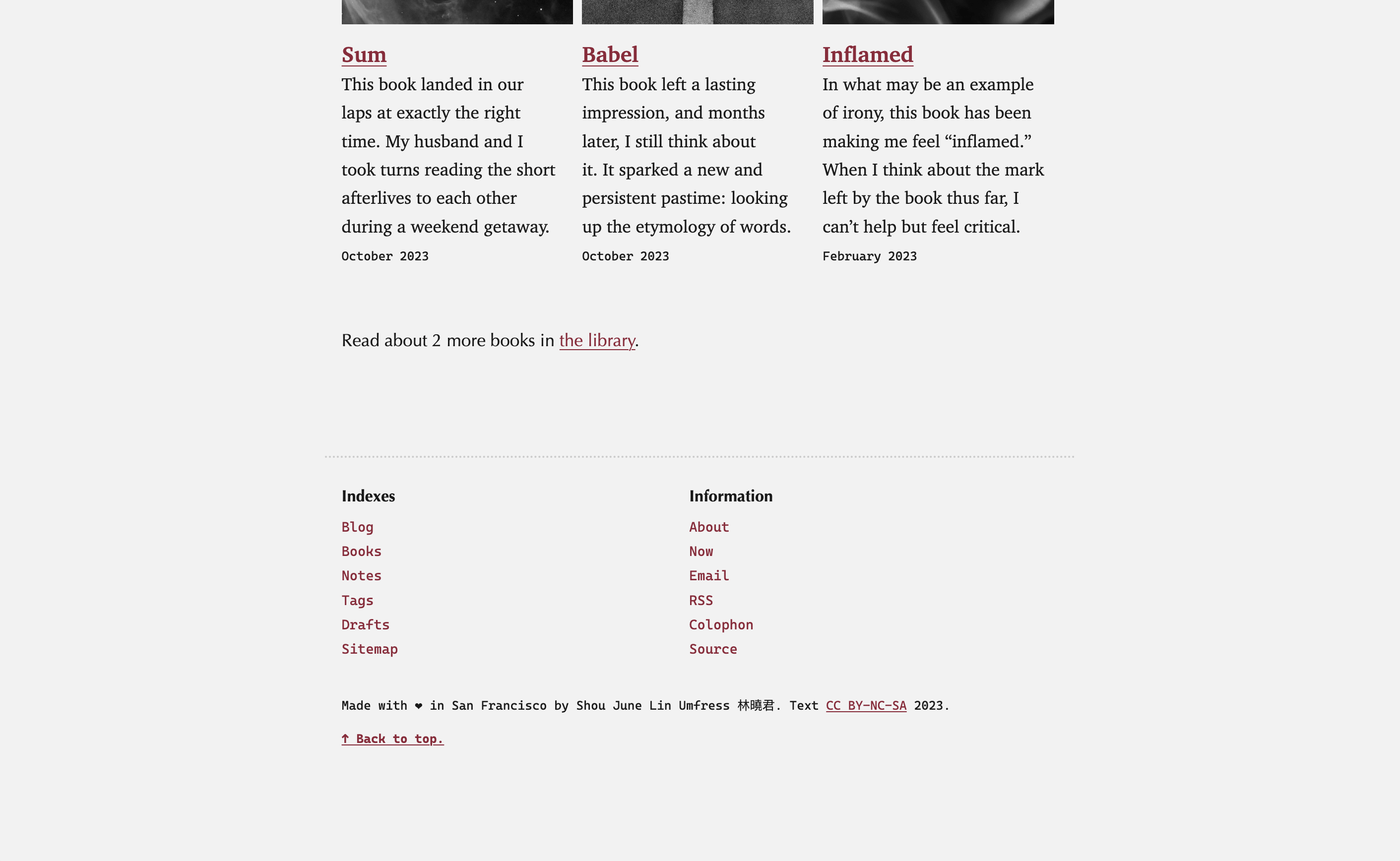
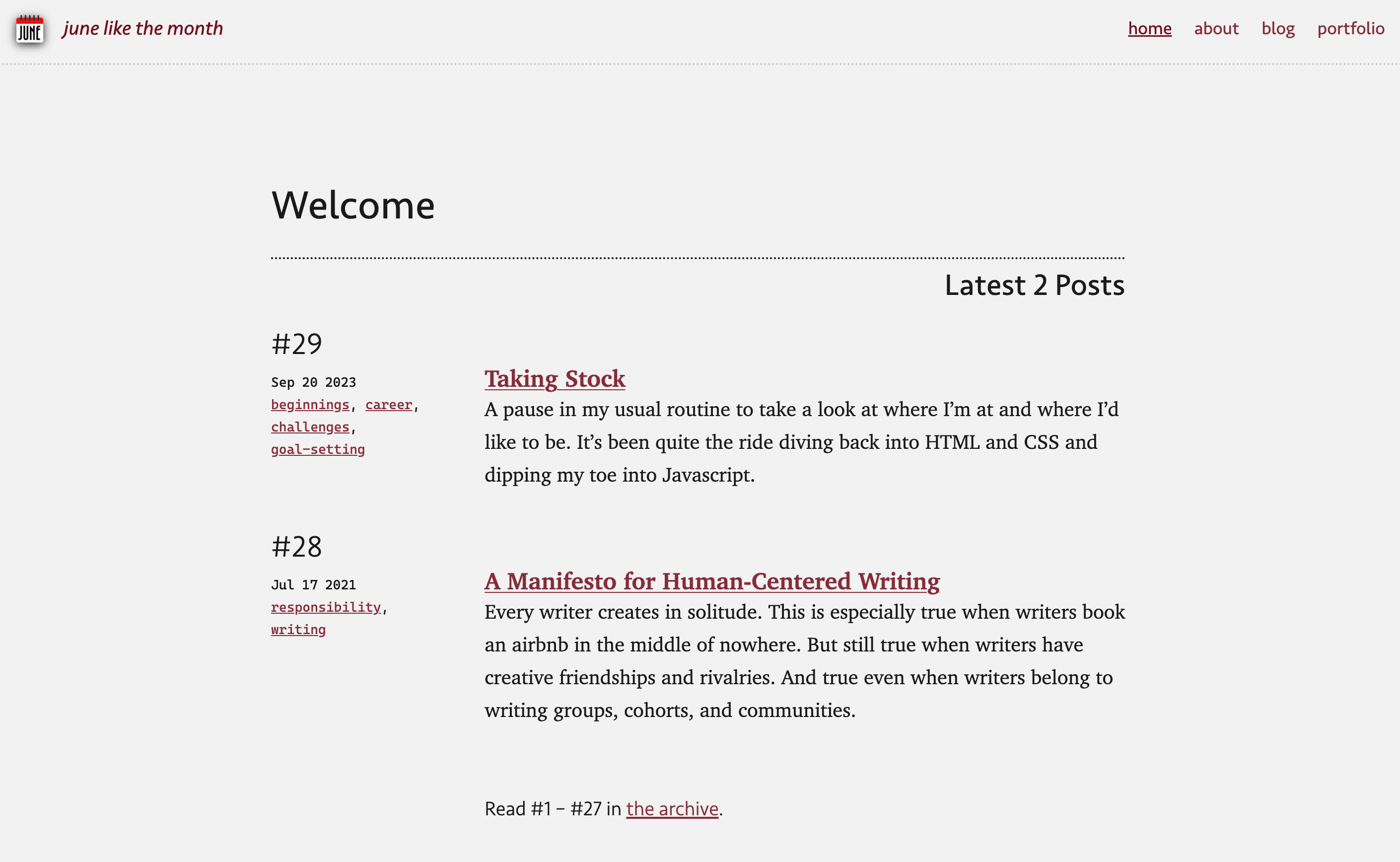
- 2023-10-04: I hated the sticky header… so I got rid of it. I redesigned the header and footer, moving all the navigation links down to the footer. I wanted to make most of the site available from anywhere, so this seemed like the best solution. We—as citizens of the web—seem to accept long footers, but not long headers, so I leaned in.


- 2023-09-19: Launched the “good enough” version, i.e. the first draft.

